Mobile computing is rapidly on the rise, the mobile industry is witnessing a huge demand for mobile devices across geographies. To meet the consumer demand, mobile phone manufacturers are developing android devices that come in screen sizes and display resolutions. It has become quite challenging for mobile application developers to create standard UI designs for mobile phones and tablets due to the wide-ranging variations in their screen size and resolution.
Mobile application developers are expected to create applications that are device independent and run seamlessly across a broad range of android devices. This blog aims to address some key concerns and issues a mobile app developer faces during application UI design.
UI Design
User Interface design or popularly known as UI design plays a decisive in the success or failure of a mobile app. A mobile app is considered flawless, when its UI design can easily adapt to a wide range of mobile devices. As we progress with this blog, we will try to identify few best practices to design a standard UI that works remarkably well on android phones and tablets.
In order to create an outstanding UI design, it is essential for app developers to first segregate android mobile devices into various categories (buckets). Below is an illustration that depicts various categories of mobile devices based on their screen size and display.
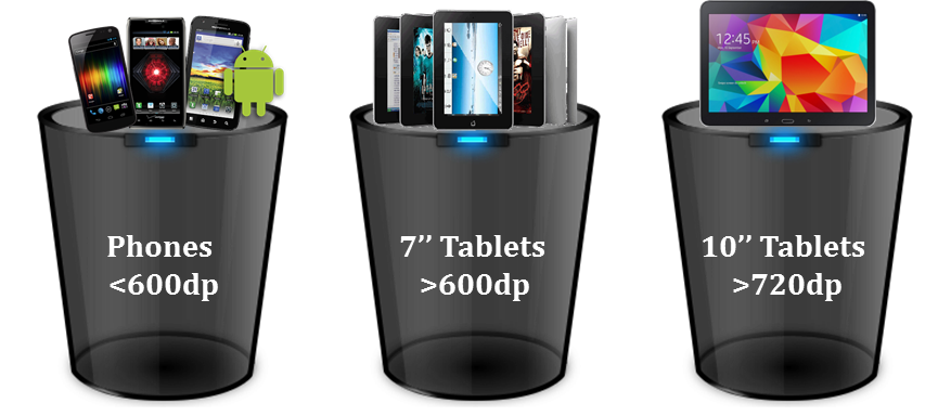
It is important to note that, even though few mobile devices share the same screen size, but they differ in terms of screen density.
Screen Density
Most of the mobile app developers must be aware about screen density, it is the resolution of a screen, which is measured in dots per inch (DPI). It is simply not enough for a UI designer to classify mobile devices based on their screen sizes, but they should also classify these based on their screen densities.
To make it clearer, let’s consider an example of two distinctive mobile phones, which are part of the same bucket (in terms of screen size), but vary in their screen densities (refer the table below).
Even though both these mobile phones (Nexus one and Nexus 5) are part of the same bucket, their screen densities vary to a great extent. If you observe, Nexus One’s pixel density is 252 DPI-HDPI, whereas Nexus 5’s pixel density is 445 DPI-XXHDPI. Screen density starts with a low DPI (120 DPI) and gradually increases to higher values (medium, high and extra high density).
Density-independent Pixels (DP)
To figure out the impact multiple screen densities can have on a mobile device, let’s take an example of a 35 pixel button. Generally, a 35 pixel button on a low-end DPI device looks relatively good. However, the same button may appear minuscule on a high-end DPI device. To avoid this variation, Android recommends UI designers to adopt density-independent pixels (DP) unit of measurement instead of standard pixels. This would help in making images appear standard on a wide range of devices, irrespective of their varying screen densities.
Before commencing UI designing, mobile app developers should first evaluate the screen density of a mobile device. Images are a key element of a rich UI design, as a standard practice, UI designers should utilize images that adapt to a wide-ranging screen densities. Here are some best practices that would help you create a stable mobile UI design.
Alternative Resource Folders
It is always recommended to create alternative resource folders for images and layouts, which would help Android OS to load relevant images depending on the screen density and resolution of the mobile device. To ensure images appear standard on all devices (irrespective of their screen densities), it is a good practice to create an alternate drawable resource folder for different screen densities, keeping medium DPI (MDPI) as the base density.
MDPI – 1DIP= 1px
HDPI – 1DIP = 1.5px
XHDPI – 1DIP = 2px
XXHDPI – 1DIP = 3px
XXXHDPI – 1DIP = 4px
Store all images in relevant drawable folders (as shown below).
drawable- mdpi
drawable- hdpi
drawable- xhdpi
drawable- xxhdpi
drawable- xxxhdpi
Layout Designing
UI designers should create multiple layouts for mobile devices with varying screen densities. Let’s take an example of the master and details view, which helps us to understand mobile layout designing in a better way.
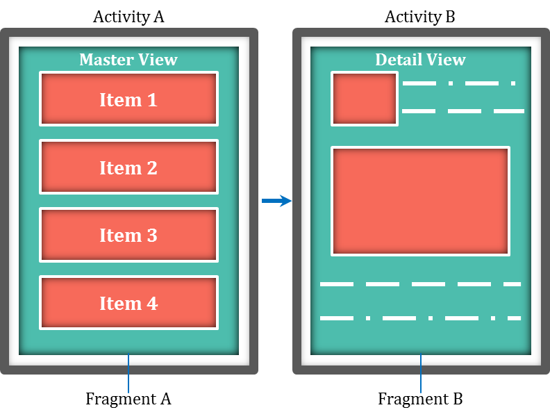
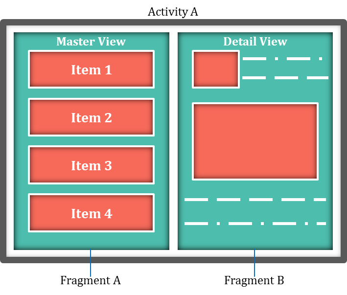
UI design and functionality varies to a great extent between a mobile phone and a tablet. Take an instance of Android settings page, the settings list and setting details will open in a separate/new screen on a mobile phone, whereas on a tablet these screens (setting list and details) will open simultaneously (side by side). Below are a few illustrations that clearly showcase the difference in design and functionality between a mobile phone and a tablet.
Separate screens shown for two activities on a mobile phone:
Two screens shown simultaneously for the same activity on a tablet:
The following complexities will arise, if mobile app developers try to achieve the above functionality using activities alone:
- Complicated intent handling and intent filters
- Risk of tight coupling
- Security concerns
In order to avoid the above complications, Android recommends the usage of a concept known as fragment.
Fragments
A fragment is a user interface having its own life-cycle. Fragments can be hosted by activities and can be easily replaced by another fragment. An activity can host one or more fragments at a given time. However, fragments are not aware about any other fragments hosted within the same activity. The communication between the various fragments hosted in the same activity is achieved via activity only.
Let’s try to visualize the above mentioned functionality using a fragment. An activity consists of a layout and a Java file, in a similar manner fragments also contain XML and Java files. A view’s design is created in fragment XML and activity is responsible to host the required fragment (i.e. to attach and detach the fragments).
Below is the process to be followed to use activities and fragments with alternative resource folder to support multiple screen densities.
Mobile Phone
On a mobile phone, list and details are displayed in two activities. Hence the folder structure should contain a list activity and a detail activity. The UI should be placed in the list fragment and detail fragment and hosted accordingly.
Directory Structure
Below is the directory structure that should be followed to create a user interface (mobile phone).
res/layout
ListActivity.xml – contains list fragment
DetailAcitivty.xml – contains detail fragment
Tablet
Whereas for Android tablets, developers have to create a UI design in such a manner that both screens have to be displayed along (simultaneously), it is mandatory that both these fragments should be hosted in a single activity i.e. ListActivity.
Directory Structure
Here’s the directory structure that has to be followed, while designing a UI for a tablet.
res/layout-sw600dp
ListActivity – contains both list fragment and detail fragment
Even though alternate XML files are available for the activity layout design, the activity Java file will remain the same. Developers need to set conditions in the activity Java file to easily identify, whether the application is being accessed via an Android mobile phone or a tablet. The following activities should be initiated based on the type of device.
On a mobile phone – DetailActivity should be launched, which hosts the detail fragment.
On a tablet – Detail fragment side to List fragment should be launched without being concerned about DetailActivity.
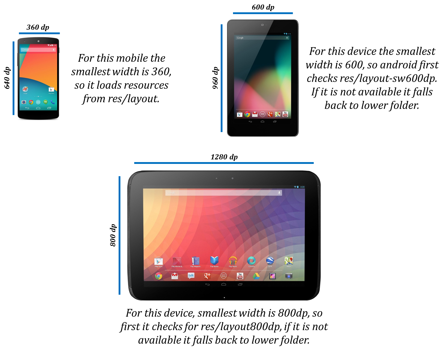
How Does Android OS identify, which layout has to be inflated:
The layout folder name contains a “sw” qualifier, it is the smallest width of a device. Based on the smallest width of a device, Android OS retrieves the layout from respective folders and inflates on the screen i.e. res/layout, res/layout-sw600dp and res/layout-sw720dp.
Here’s an illustrated example of the above procedure:
In a similar way, depending on a mobile device’s screen density, Android OS validates relevant drawable folder i.e. if a folder does not contain relevant images, it falls back to a lower level folder to select an image. Based on the XML inflated by the Android operating system, the activity Java file is can identify whether the device is a mobile phone or a tablet.
Conclusion
More and more consumers are utilizing mobile devices for their day-to-day activities and the demand for smart mobile devices is growing. With the constant changes in screen dimensions and resolutions, mobile developers are facing challenges in terms of UI design. UI designers should try to come out with innovative ideas to adapt to these market dynamics. The above inputs and suggestions will certainly help mobile developers to create UI designs and layouts that adapt to a wide-range of mobile devices with varying screen sizes and resolutions.
Author
 |
Sravanth Addanki is a Senior Technical Associate at Evoke Technologies with over 8 years of experience in the software industry. He specializes in mobile application development predominantly for Android devices. In his spare time, he likes to read and explore emerging technologies. |


3 Comments
how to text size in tablet , i mean how to look text size same ration in tablet.
i have created an app for android device but how to convert it in tablet app
Using SDP’s will be made easy as there are all dimens provided for all dimensions.