
Introduction
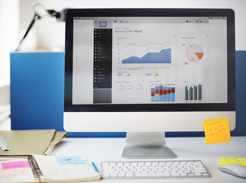
Dashboard is a type of interface which provides business overview using different charts, graphs, and data tables. Bonita BPM provides the dashboard to monitor the processes, cases with performance details but not the Business Transactional data, which is often considered the most important type of data to monitor the business activities on a higher level.
Bonita BPM is flexible enough to integrate third-party plugins to achieve the Business Intelligence dashboard as per business user’s requirement. Bonita BPM is very helpful for developers to implement the Custom User Interface for the dashboard through Angular MVC (Model, View, and Controller) architecture, which is also quite popular among UI Developers. It allows developers to maintain all types of third-party script files, images, style sheets, etc., at one place.
This article is written with the purpose of helping developers create Custom Dashboard for any data, using high charts & open source control plugins.
Refer to the URL below for Highcharts & Dashboards demo: https://www.highcharts.com/demo
Dashboard is a combination of various Graphs, Charts, Data Tables, and Data Elements. To make the implementation easier, we will split each Graph/Chart/Table in a separate widget. It will make it easier for a developer to implement or maintain a widget. We will implement each widget separately, by combining all widgets in an Application Page or a form on the Bonita BPM platform. This will help us to generate a dashboard.
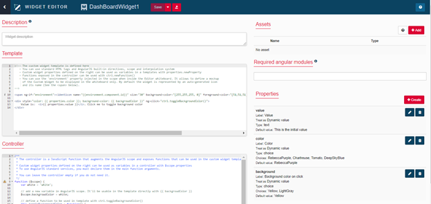
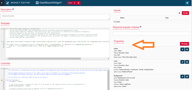
Custom widgets are created by selecting the custom widget option from the “Create” button on UI Designer. UI Designer is a graphical development environment for creating pages and forms for Bonita BPM applications. UI Designer can be launched from the Bonita studio and works on AngularJS. There are six different sections in the custom widget. These include:
- Description
- Template
- Controller
- Assets
- Required Angular Modules
- Properties
Description tells about the widget. Precisely, it holds the information regarding what the widget is all about.
Template is a HTML code which describes the look and feel of the custom widget in the web browser.
Controller is an angular controller method which holds the actual widget logic.
Assets are the external files like JavaScript, CSS or Images which are being used by the custom widget.
Required Angular Modules are the AngularJS modules declaration if the widget uses services or directives that are not built into AngularJS framework.
Properties is the way to communicate with the widget.
Creating custom widgets with Bonita UI Designer is not very difficult. To understand the UI Designer in detail, first we start with the simple Hello World widget and then proceed with the complex widgets, like Tree widget.
Creating the Hello World Widget
This section describes creating a simple Hello World widget in a step-by-step manner.
Step 1:
- Launch the UI Designer from the Bonita Studio by clicking on UI Designer button. This opens a page in the web browser with the UI Designer layout.
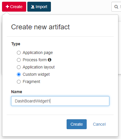
- Click on the “+Create” button, select “Custom widget” from the dropdown menu and provide the name of the widget as shown in the below figure.
- Click on Create button to create the widget. This will create a widget as shown in the figure below.
Step 2:
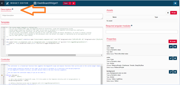
Provide any text in the description section as shown in the below figure. It’s considered an optional section.
Step 3:
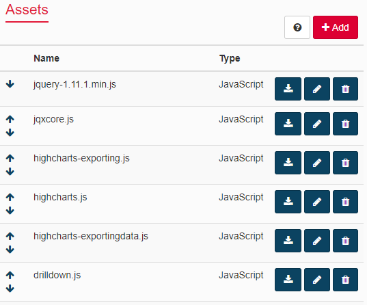
Add The dependencies like CSS, JS, and image files in the assets section like shown below. These assets will be available to use in Template and Controller.
Step 4:
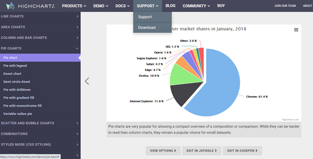
Open the Highcharts official site, i.e., https://www.highcharts.com/demo and select desired graph/chart. The page will look as shown below.
Step 5:
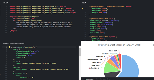
To get the code snippet of the respected graph/chart, click on “EDIT IN JSFIDDLE” / “EDIT IN CODEOPEN”. The page will look as shown below.
Step 6:
Replace the existed code of the template with below mentioned snippet or code obtained from the “HTML” Section shown in the above screenshot.
<!DOCTYPE html>
<html>
<head>
<script type="text/javascript" src="/widgets/customGraphWidget/assets/js/graphportlets.js' />"></script>
<script src="https://code.highcharts.com/highcharts.js"></script>
<script src="https://code.highcharts.com/modules/data.js"></script>
<script src="https://code.highcharts.com/modules/drilldown.js"></script>
<style>
.panel-actions {
margin-top: -20px;
margin-bottom: 0;
text-align: right;
}
.panel-actions a {
color:#333;
}
.panel-fullscreen {
display: block;
z-index: 9999;
position: fixed;
width: 100%;
height: 100%;
top: 0;
right: 0;
left: 0;
bottom: 0;
overflow: auto;
}
</style>
</head>
<body class="no-skin default">
<div class="panel panel-default">
<div class="col-md-12 column sortable sla_divmargin" style="padding-left:0px;">
<div class="portlet portlet-sortable box blue ui-sortable-handle">
<div class="portlet-title">
<div class="caption">
<i class="icon-speedometer font-red-flamingo"></i>
<span class="caption-subject bold font-red-flamingo uppercase">
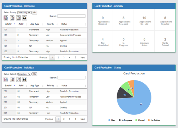
Card Production - Status </span>
<span class="caption-helper"></span>
</div>
<div class="tools">
<a href="#" id="YrlyRprtpanel-fullscreen" role="button" title="Toggle fullscreen">
<i class="glyphicon glyphicon-resize-full"></i></a>
</div>
</div>
<div class="portlet-body" id="ntmProdChart">
<div class="clearfix"></div>
<div class="row" style="position:relative;">
<div class="clearfix"></div>
<div id="databasediv_print">
<div class="col-sm-12 no_padding" style="border-bottom:1px solid #9fd6bc;">
<div id="container" style="width:100%; height:360px; margin: 0 auto;"></div>
</div>
</div>
</div>
</div>
</div>
</div>
</div>
</body>
</html>
Step 7:
Replace the existed code of the controller with the below snippet or code obtained from the “JavaScript” section as shown in the above screenshot.
function ($scope) {
var App_performance;
App_performance = Highcharts.chart('container', {
chart: {
plotBackgroundColor: null,
plotBorderWidth: null,
plotShadow: false,
type: 'pie'
},
title: {
text: 'Card Production'
},
subtitle: {
text: ''
},
/* tooltip: {
pointFormat: '{series.name}: <b>{point.percentage:.1f}</b>'
},*/
navigation: {
buttonOptions: {
enabled: true
}
},
plotOptions: {
pie: {
allowPointSelect: true,
cursor: 'pointer',
dataLabels: {
enabled: true,
format: '{point.y}',
distance: -50,
style: {
color: (Highcharts.theme && Highcharts.theme.contrastTextColor) || 'black'
}
},
showInLegend: true
}
},
"series": [
{
"name": "Status",
"colorByPoint": true,
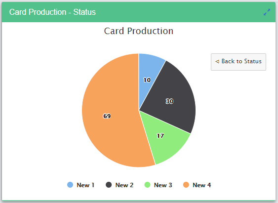
"data": [
{
"name": "New",
"y": 62,
"drilldown": "New"
},
{
"name": "In Progress",
"y": 10,
"drilldown": "In Progress"
},
{
"name": "Closed",
"y": 7,
"drilldown": "Closed"
},
{
"name": "No Action",
"y": 5,
"drilldown": "No Action"
}
]
}
],
"drilldown": {
"series": [
{
"name": "New",
"id": "New",
"data": [
[
"New 1",
10
],
[
"New 2",
30
],
[
"New 3",
17
],
[
"New 4",
69
]
]
},
{
"name": "In Progress",
"id": "In Progress",
"data": [
[
"In Preparation",
4
],
[
"Ready For Assessment",
1
],
[
"In Production",
2
],
[
"Ready for Sign-off",
2
]
]
},
{
"name": "Closed",
"id": "Closed",
"data": [
[
"Closed 1",
20
],
[
"Closed 2",
29
],
[
"Closed 3",
27
],
[
"Closed 4",
72
]
]
},
{
"name": "No Action",
"id": "No Action",
"data": [
[
"No Action 1",
39
],
[
"No Action 2",
96
],
[
"No Action 3",
36
],
[
"No Action 4",
63
]
]
}
]
},
exporting: {
filename: CARD Production - Status Stats'
}
});
/*App_performance = Highcharts.setOptions({
colors: Highcharts.map(Highcharts.getOptions().colors, function (color) {
return {
radialGradient: {
cx: 0.5,
cy: 0.3,
r: 0.7
},
stops: [
[0, color],
[1, Highcharts.Color(color).brighten(-0.3).get('rgb')] // darken
]
};
})
});*/
$(document).ready(function () {
//Toggle fullscreen
$("#YrlyRprtpanel-fullscreen").click(function (e) {
App_performance.setSize(1263 , 700);
e.preventDefault();
var $this = $(this);
if ($this.children('i').hasClass('glyphicon-resize-full'))
{
$this.children('i').removeClass('glyphicon-resize-full');
$this.children('i').addClass('glyphicon-resize-small');
}
else if ($this.children('i').hasClass('glyphicon-resize-small'))
{
$this.children('i').removeClass('glyphicon-resize-small');
$this.children('i').addClass('glyphicon-resize-full');
App_performance.setSize(594 , 360);
}
$(this).closest('.panel').toggleClass('panel-fullscreen');
// alert('3');
});
});
}
Step 8:
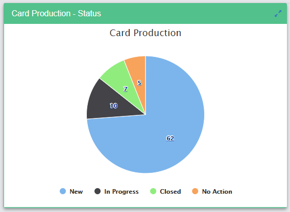
Place the widget in the form/application page and the output will look as shown below. It’s a drilldown chart. The user can drill down one level at a time.
Below is the output after drill down. User can navigate to original chart by clicking on “Back to Status” button.
Step 9:
DatasetS which were used in the Step #7, can be passed dynamically through Data Mapping properties as a JSON. We can customize the colors, format of the Chart/Graph through the code shown in the Step #7.
Step 10:
By repeating the Step #1 & Step #9, we can create various graphs/charts (obtain the respected graph/chart code from the Highcharts site and replace them in the template and controller section of the custom widget) as per business requirement. By Getting all different custom widgets together in a single form or single application page, we will get a complete dashboard to monitor the overall business processes. Sample dashboard will look as shown below.
Summing Up
A business that is involved in the process steps or transactional or lifecycle phases, needs more efficient business intelligence. Business intelligence gives a complete overview of the business from all perspectives. It will also be useful in taking the necessary, corrective/preventive actions to avoid issues and improve the efficiency and quality of the system. The Customized Business Intelligence Dashboard will always help the top management to monitor several aspects of business processes seamlessly at all times.
Author
 |
Paparao Nadipineni is an Associate Architect at Evoke Technologies with experience in Solution Design, Development, and Maintenance Stages of SDLC leveraging BPMN, Java, and Python. Paparao strongly advocates the benefits of a customer-centric business strategy and is capable of resolving user and business problems leveraging the latest technologies in the field of Solution Architecture. In his free time, he enjoys reading books, going on long drives with loved ones, and exploring new technologies. |